The Idea
A lot of apps connect to Spotify and tell you things you already know — your top artists, your most-played songs. I wanted to do something more unexpected with that data. Baseball players choose walk-up songs that play as they step up to bat, and there's a rich database of those choices across current and former MLB players. The premise: if your music taste overlaps with a player's walk-up music, they're on your team.
It's a simple concept, but making the results feel meaningful — not random — required a matching algorithm with real depth behind it.
From Spotify to Roster
You connect your Spotify account, and the app pulls your top tracks, top artists, saved songs, and genre profile across multiple time ranges. On the other side is a database of MLB players with their walk-up songs, linked to Spotify track IDs and tagged with genres.
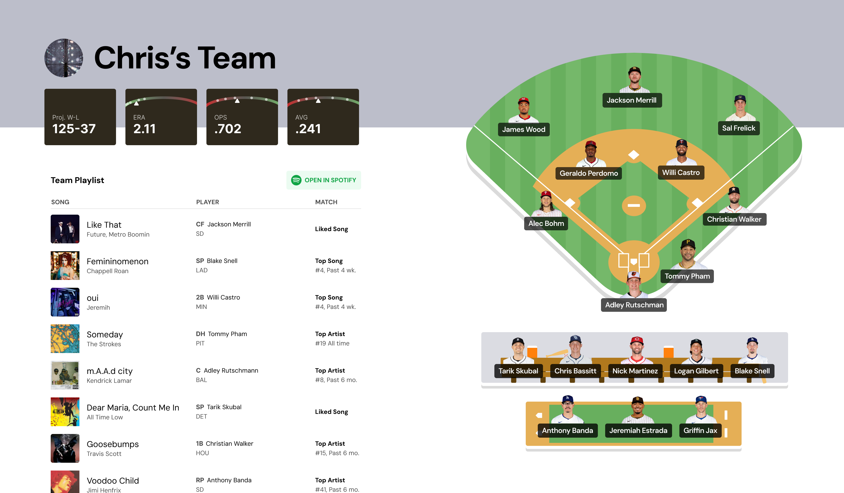
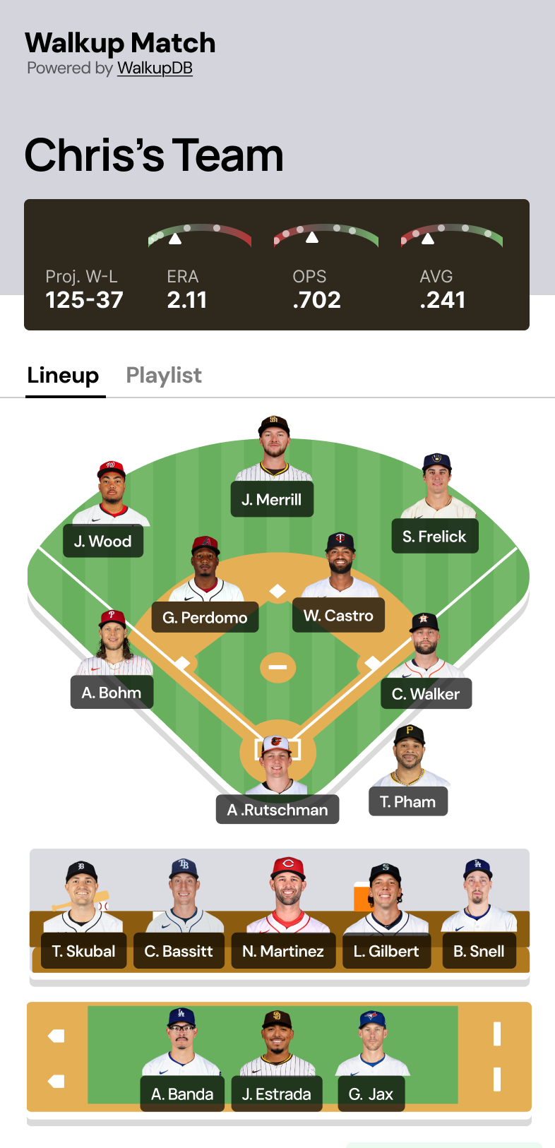
The app scores every player against your profile, then assembles a full roster — one player per position — optimizing for match quality while keeping the team balanced. Once your team is built, it pulls each player's real stats from a live sports API to calculate team averages and a projected win-loss record.
The Matching Logic
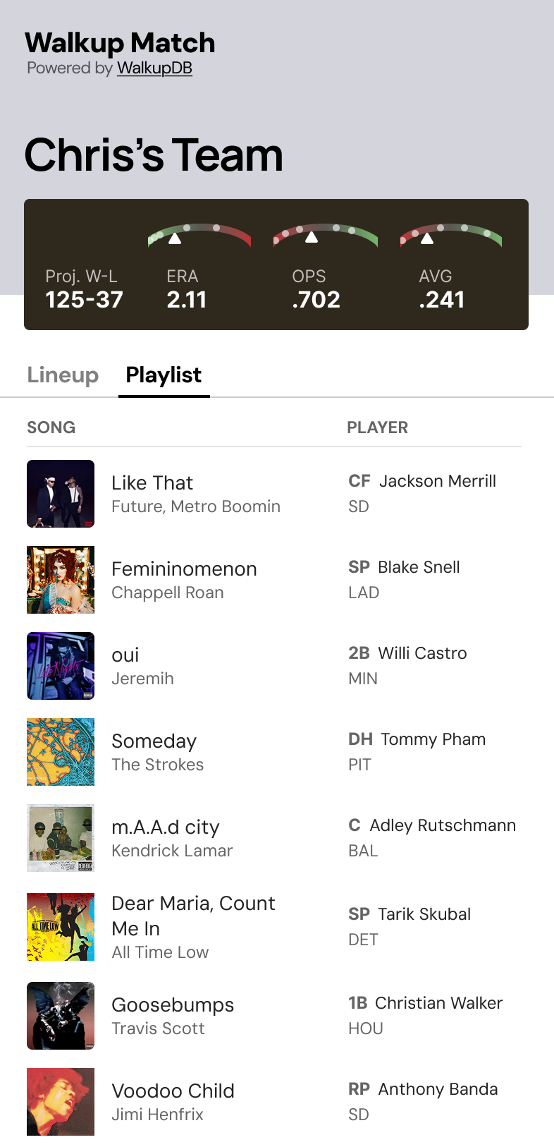
Each player's walk-up songs are scored against your Spotify data on three dimensions: direct song matches (you listen to the same track), artist matches (you listen to the same artist), and genre overlap (your top genres align with the song's genres). A song you've actually liked or saved carries the most weight — it's the strongest signal that the match is real.
Time range matters too. A track in your long-term top songs says more about your taste than something you binged last week, so the algorithm weights accordingly. Rank also factors in — your #3 artist is a stronger match than your #47.
When assembling the team, the algorithm fills positions one at a time, applying two constraints that keep the results interesting: a genre diversity boost (so your team isn't nine players who all share one genre) and an artist repetition penalty (so one popular artist doesn't dominate the roster). The result is a team that genuinely reflects the range of your music taste.
Team Stats & Projected Record
Once your roster is locked, the app hits a live sports API to pull real stats for each player — batting average, OPS, ERA, and more. It aggregates these into team-level numbers and generates a projected win-loss record, so you can see whether your music taste would produce a playoff contender or a last-place squad.
The stats are real even if the premise is absurd, which is what makes it fun. Your team's projected record is based on actual player performance, just filtered through a completely unserious selection method.
Custom Backdrops
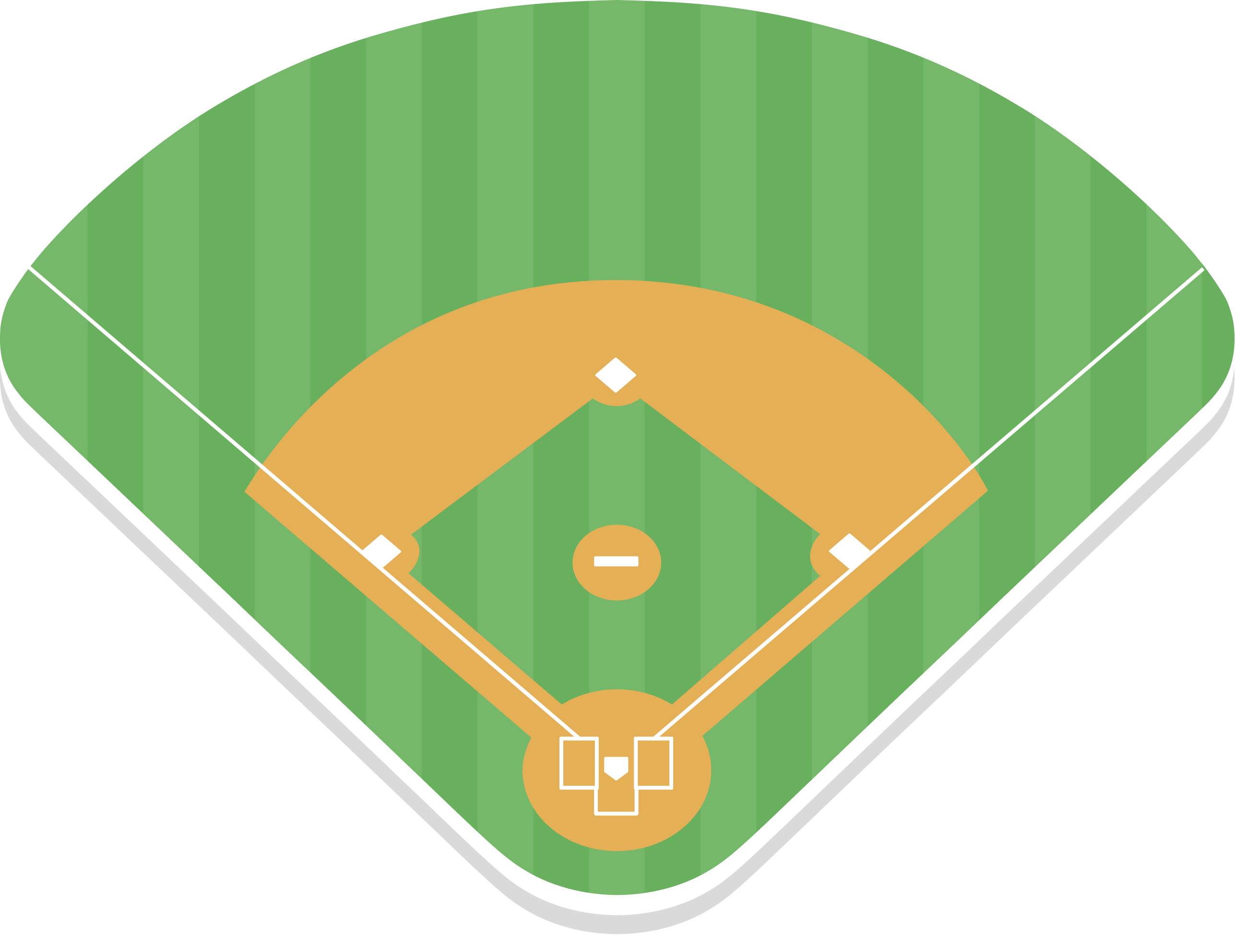
I illustrated a set of baseball environments — the field, dugout, and bullpen — used as decorative backdrops behind each player on their card. They give the app a handmade, editorial quality that sets it apart from the typical data-heavy sports interface, and help each position feel like its own scene rather than a row in a table.
End-to-End
I designed and built this end-to-end — Figma for the UI, React and Next.js for the frontend, server-side API routes for the Spotify OAuth flow, matching logic, and sports data integration. The interface needed to make a dense amount of information (roster, match reasons, individual stats, team projections) feel lightweight and fun rather than like a spreadsheet.
The mobile layout was the primary target since this is the kind of thing people share and try on their phones.
