The Old System Created Errors by Default
In government contracting, employees routinely split time across multiple projects, and each project can include multiple charge lines with different budgets, effective dates, expiration dates, and constraints. When someone charges to the wrong line — or keeps charging after hours are exhausted — it creates a cascade of cleanup work for managers, administrators, and finance teams.
The original Profile experience technically contained the right information, but it didn't help users act on it. Authorizations had no hierarchy — healthy items looked identical to broken ones. Overcharges and expiring lines weren't surfaced until they became emergencies. Users relied on managers to manually flag issues, often via email.
Many employees weren't even in the system, because their assignments weren't being created through the workflow that feeds Profile. Managers were forced into a workaround loop — manually tracking hours and sending guidance emails — which increased error risk and wasted time.
Beyond a UI Redesign
This project wasn't just a visual refresh of Profile. It was a coordinated effort across the surrounding workflow so the right data existed, the right people received it at the right time, and the UI made it hard to do the wrong thing.
Upstream adoption: Before Profile could prevent errors for employees, it needed a reliable source of truth. We improved the manager-facing planning tool where effort is allocated and added a tightly integrated workflow to push updates into work authorizations in one or two clicks from the same screen. This was intentionally a "push" model — not a passive read of planned hours — because authorization hours are gated by an approval process and aren't always equivalent to what a manager intends to allocate.
Proactive prevention: We added automated email alerts when someone overcharged an authorization, routed to users' government-site email addresses when needed — a practical decision based on where employees actually are during the day. Overcharges became a moment-to-moment fix, not a delayed cleanup task.
Manager dashboard: We created a dashboard that surfaces overcharges across direct reports in a single view, with a one-click reminder email built in. Managers can still reach out personally when needed, but the default path is faster and more consistent.
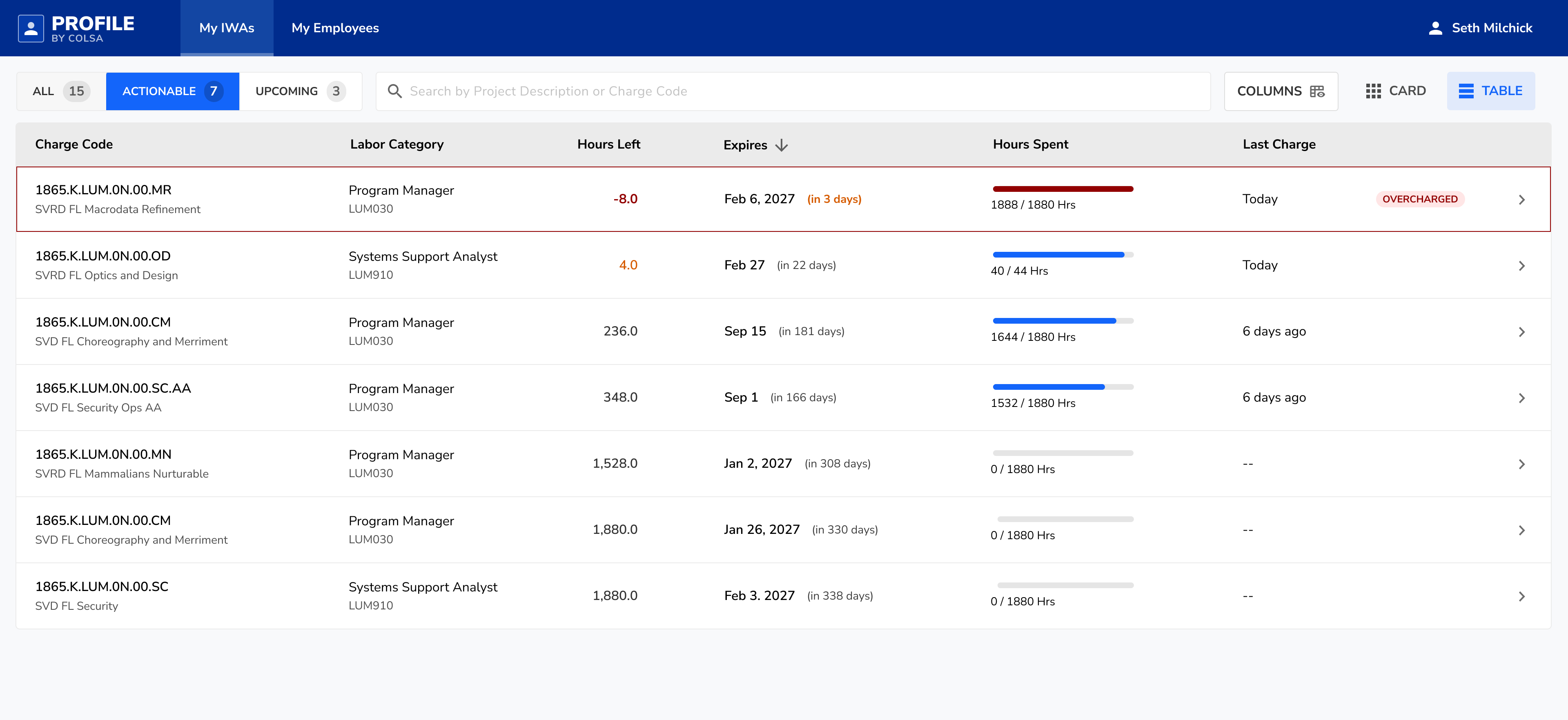
Scan, Don't Browse
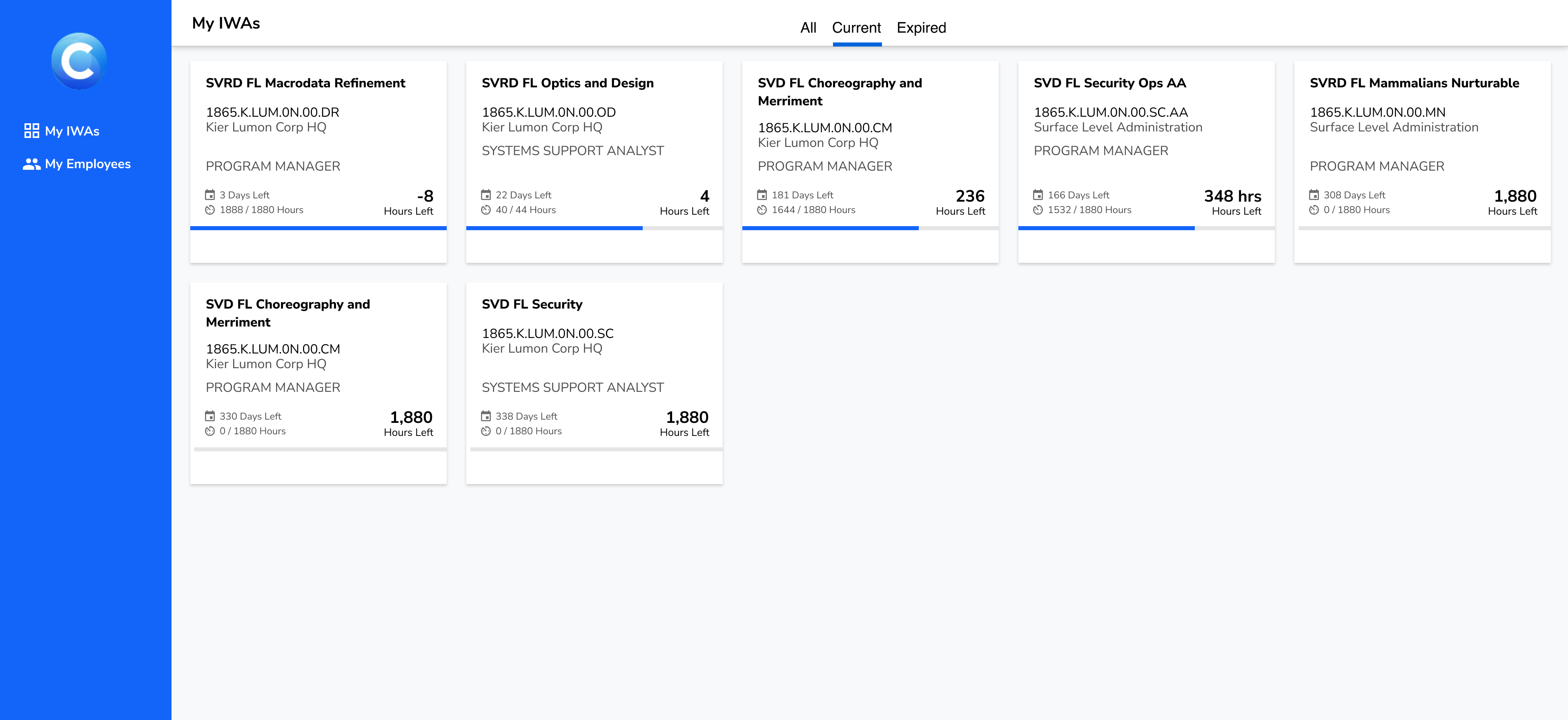
Profile is not a product people explore. It's something they open to answer a question quickly: Where can I charge today? What's about to expire? Is anything broken that I need to fix? The redesign reorganized the experience around urgency and action, not raw completeness.
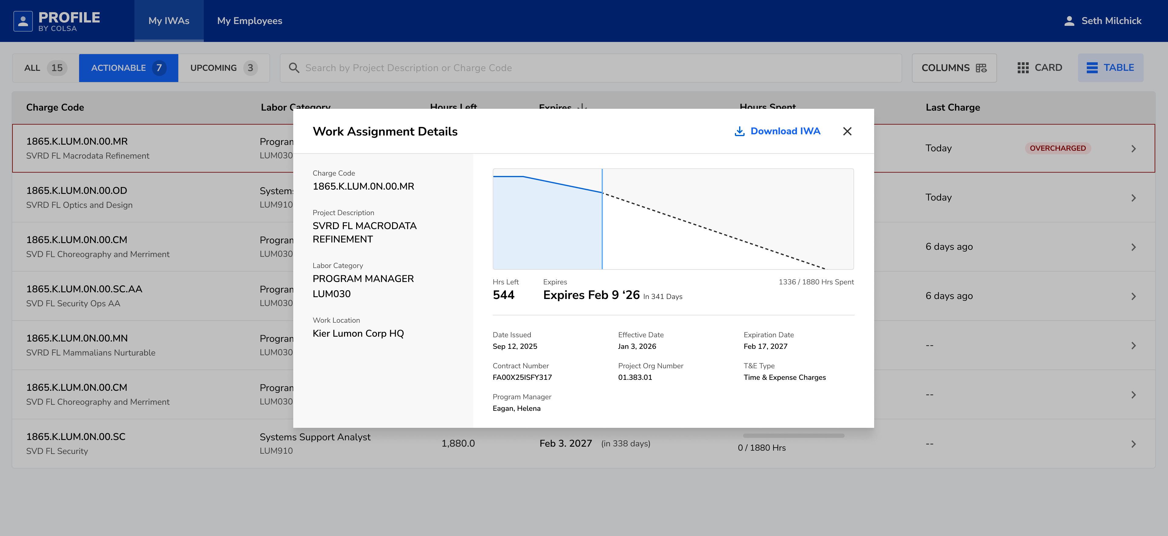
Each work authorization became a card designed for fast comprehension. Key signals are grouped and visually prioritized so users can assess an authorization without reading every field. Overcharged items are visually flagged, remaining hours and time sensitivity are easy to spot, and new or noteworthy items don't blend into the background.
This is where "digestibility" becomes error prevention: when the right line is obvious, the wrong line is less likely.
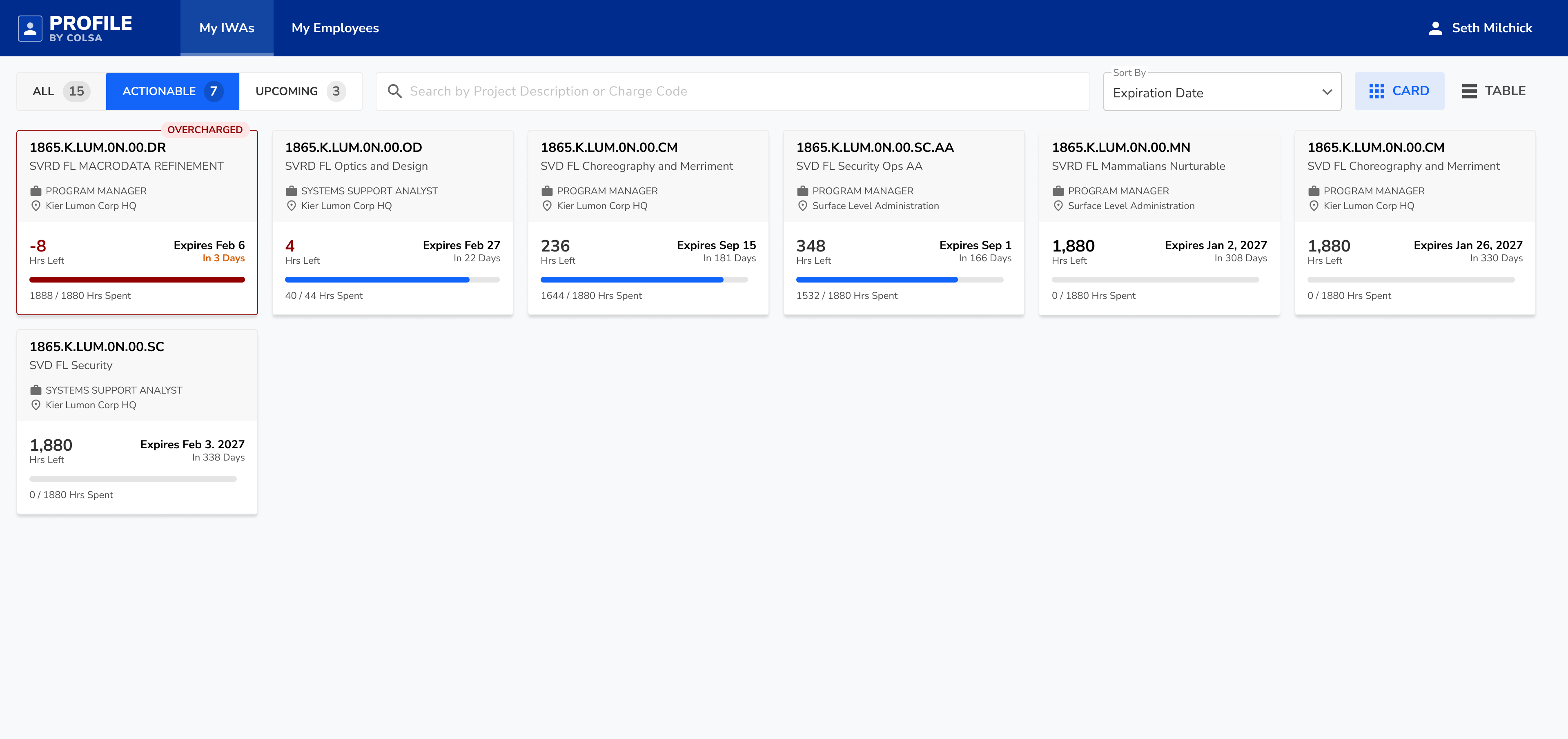
Density When You Need It
For users with many authorizations, a table view provides compact scanning with sortable columns while preserving the same status language. Sort by expiration to surface urgency. Sort by remaining hours to identify near-exhaustion. Visual status cues stay consistent so critical items don't disappear in dense layouts.
Matching How Users Think
The old tabs were All, Current, and Expired. "Expired" wasn't a primary workflow — people needed to know what they can charge to now, and what's coming next. We reframed the experience around three modes: All for full context, Chargeable for items effective today and still relevant, and Upcoming for future authorizations so users can anticipate transitions and avoid last-minute confusion.
We also introduced a "Last Charged" column as a disambiguation tool. Many work authorizations look nearly identical — similar project names, similar codes, similar time windows — and the identifiers can be opaque strings. Anchoring decisions in recent behavior ("This is the one I used yesterday") reduces selection mistakes when users are moving fast and the data isn't naturally human-readable.
Results
Profile and its surrounding improvements shifted work authorization management away from email threads and memory, and toward a system that prevents errors through better data, better timing, and clearer UI. Time-on-task improved in usability testing, unresolved overcharges decreased by 65%, and user satisfaction improved based on post-rollout survey feedback.
The biggest win wasn't visual polish. It was reducing the company's dependence on manual manager guidance and making correct charging the default behavior.