Conversion vs. Trust
The biggest UX tension was figuring out how hard to push users down the funnel without being obnoxious about it. As a small-cap media business, email signups matter — but aggressive gating degrades the reading experience and undermines credibility, especially for investors evaluating whether the site is worth returning to.
The work centered on finding the right balance: how much content should be accessible before requiring an email? Too aggressive and you turn people away. Too passive and you don't build your list. The solution was layered access — give enough value upfront to demonstrate what the site offers, then gate the more specialized tools and data.
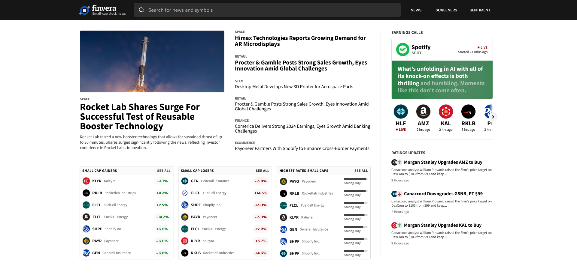
The Front Page
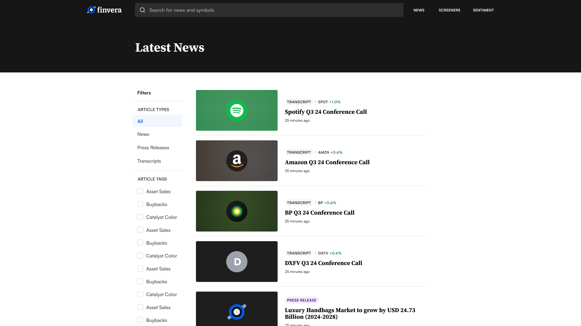
The site needed to do a lot: display news alongside comprehensive small-cap data, surface stock screeners, pull in analyst ratings, and present social media sentiment — all without overwhelming the reader. I explored several layout directions before landing on a structure that felt both fast and editorial, letting users move from "what happened?" to "what does it mean for this ticker?" without leaving the page.
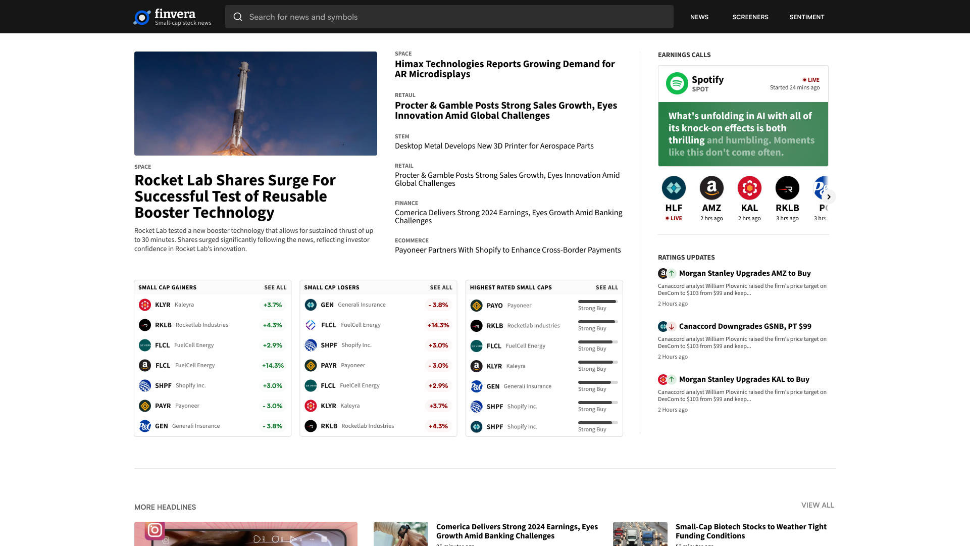
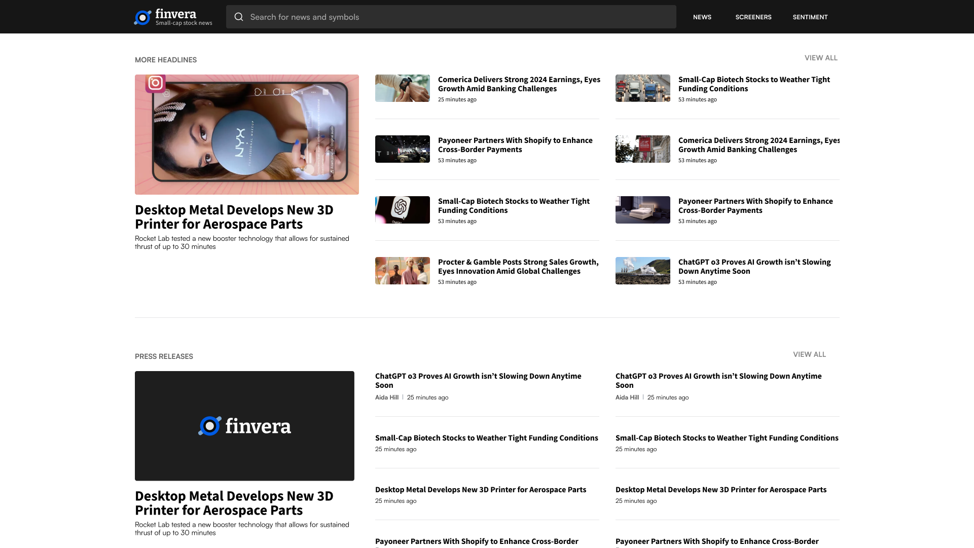
Homepage layout explorations — balancing news density with market data
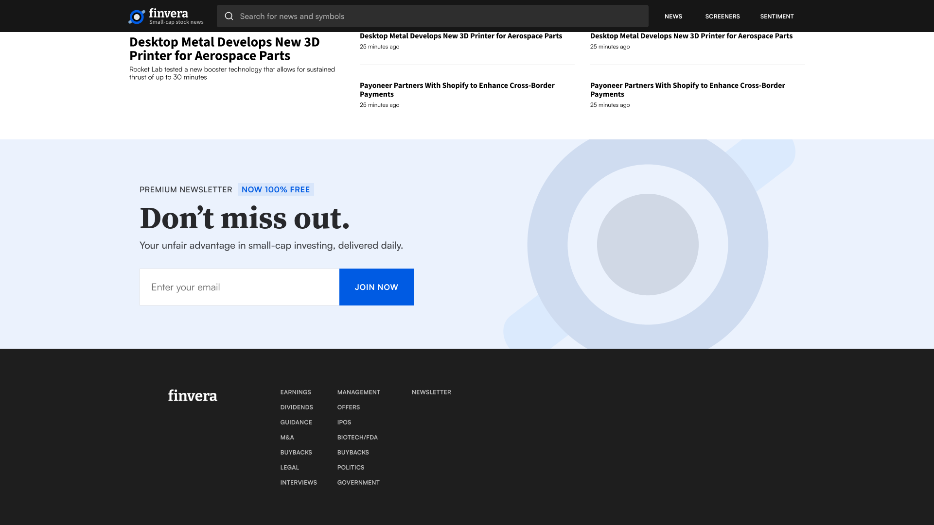
A Freewall That Nudges, Not Nags
Instead of hard-gating content immediately, I shaped the experience around allowing a limited amount of reading before requiring an email. Article layouts prioritize readability with generous whitespace and clear typography hierarchy, so users can understand the value of the platform before being asked to subscribe. The freewall placement was designed to feel earned and contextually relevant — not like an interruption.
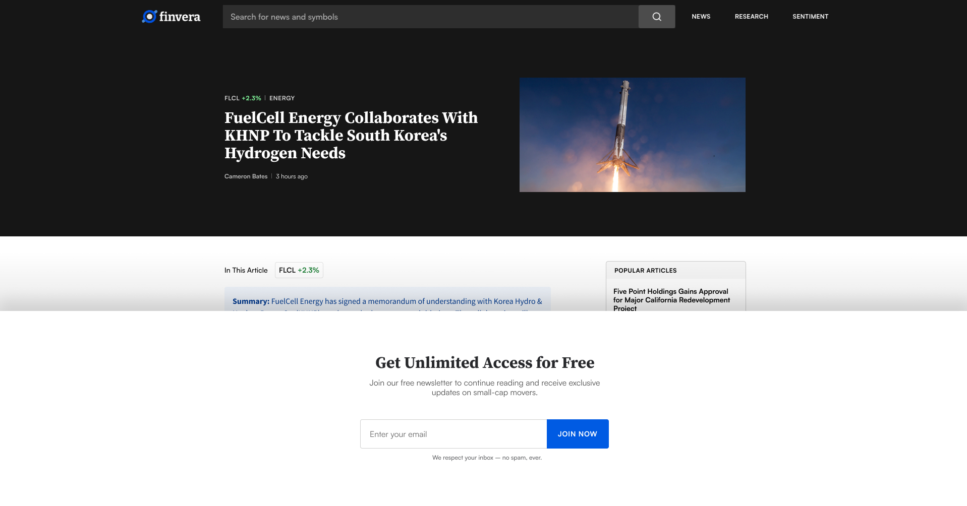
Freewall — enough content to demonstrate value before asking for a signup
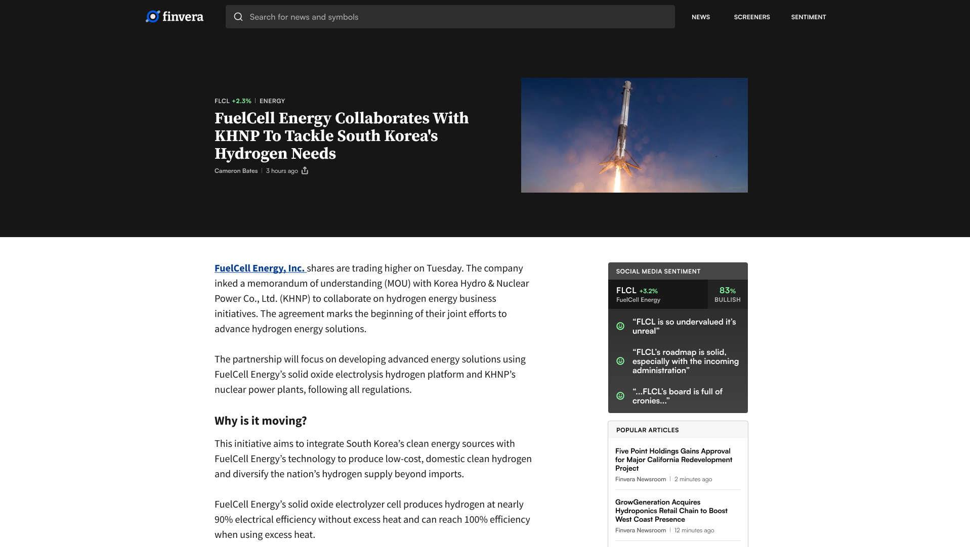
Solving the Image Problem
Articles perform significantly better with compelling visuals, but small-cap companies rarely have high-quality media kits. Being a startup, Finvera didn't have a library of images to draw from either. I designed a fallback system: the site pulls a company's logo when a ticker is the subject, detects the dominant hex code, and generates a matching background gradient. This gave every article a polished, distinct look in feeds and share previews without requiring the team to source or license images for every post.
Algorithmically generated article images — logo + dominant color gradient
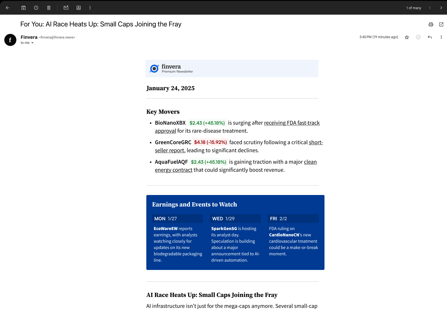
Newsletter templates using the same visual system
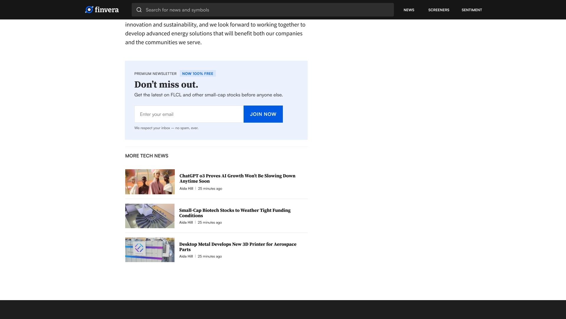
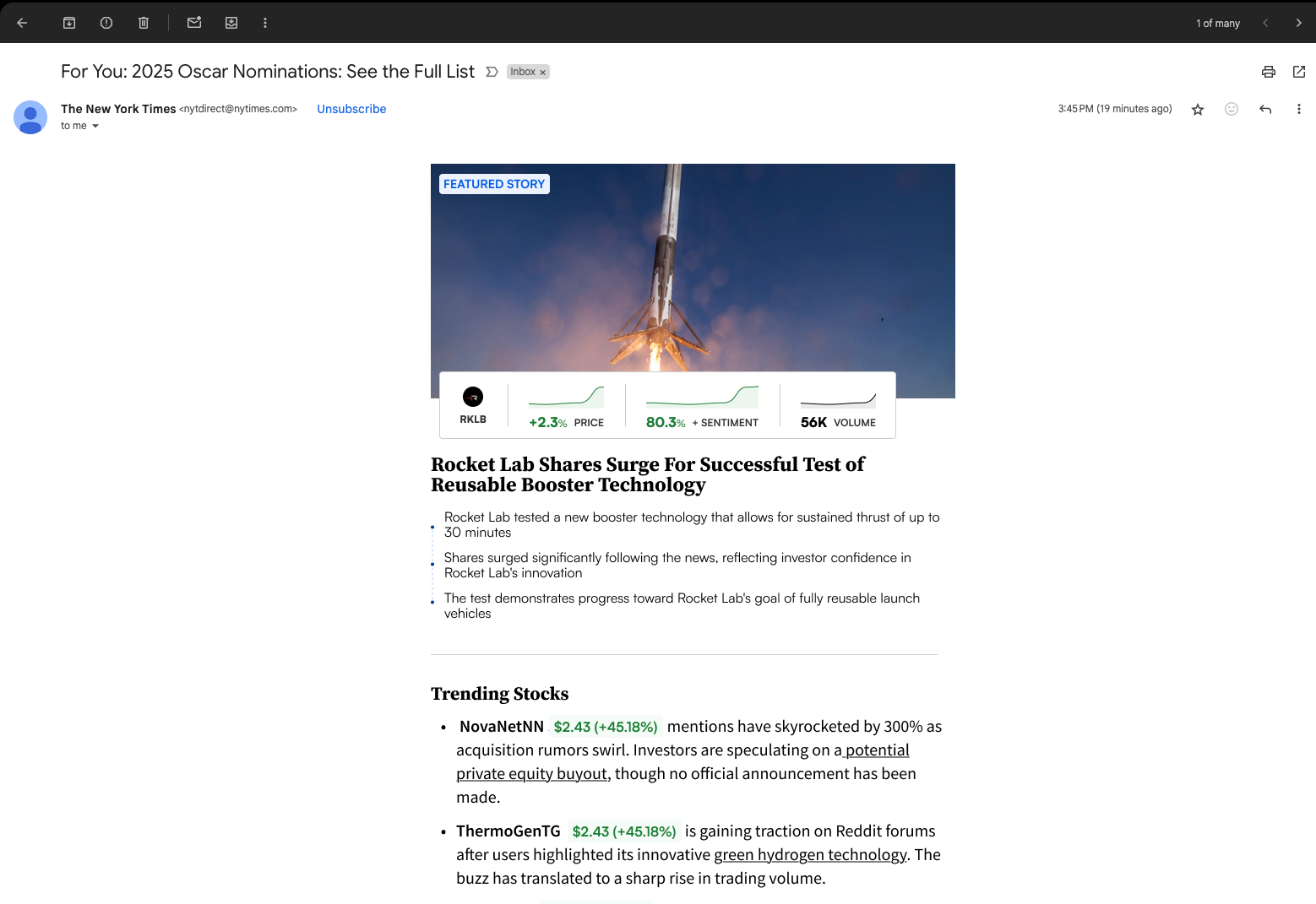
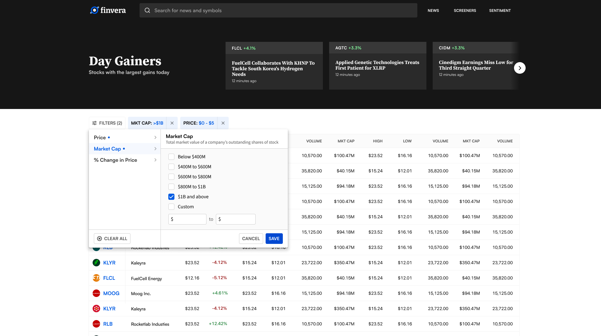
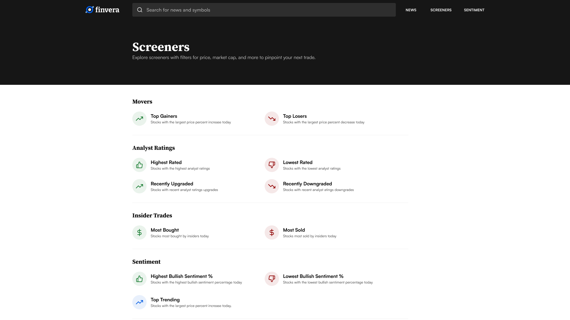
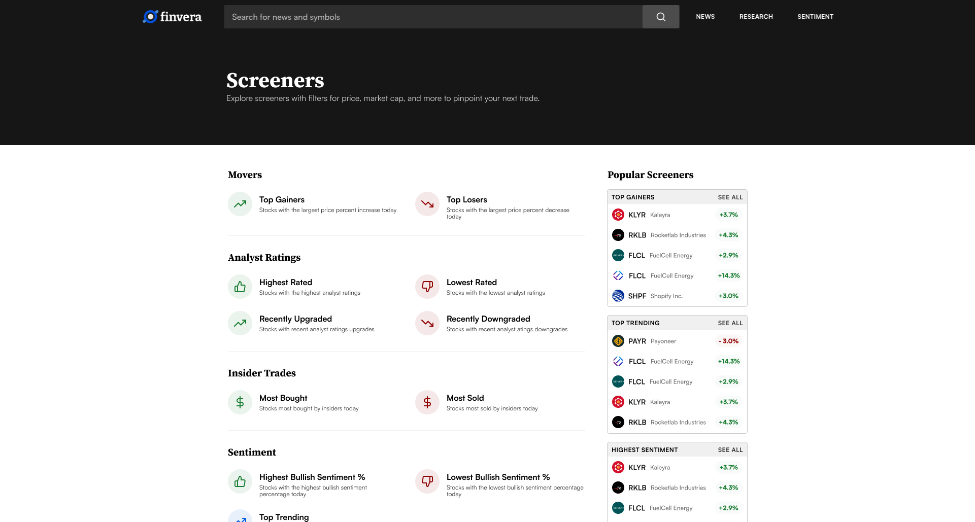
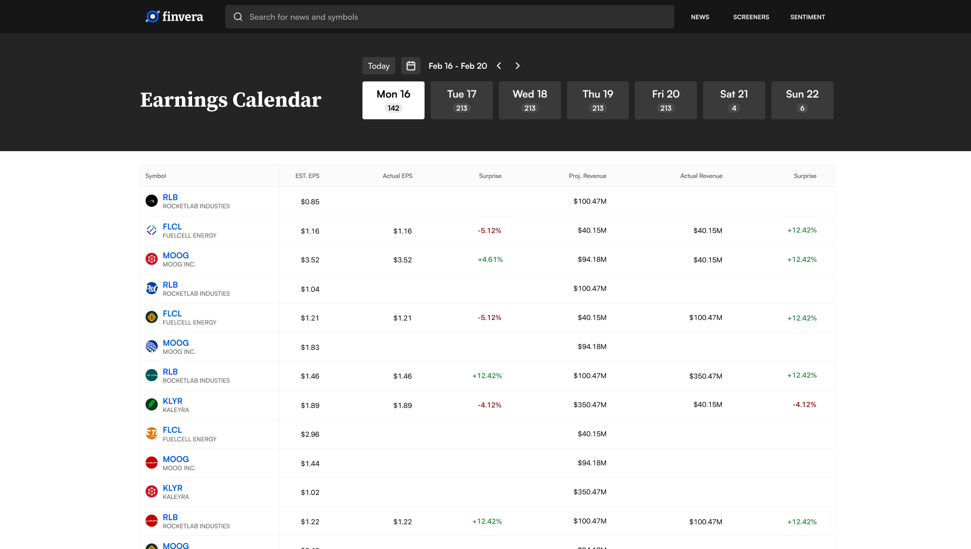
Making Dense Data Usable
The platform includes stock screeners (top gainers, top losers, highest and lowest rated), earnings calendars, individual quote pages, and live earnings call transcripts. These are the most data-dense pages in the product, so the design focused on making complex filtering feel straightforward — supporting real workflows without parameter overload. Social media sentiment is surfaced alongside traditional analyst ratings, but presented as a supporting signal rather than the main event, so it adds context without competing for attention.
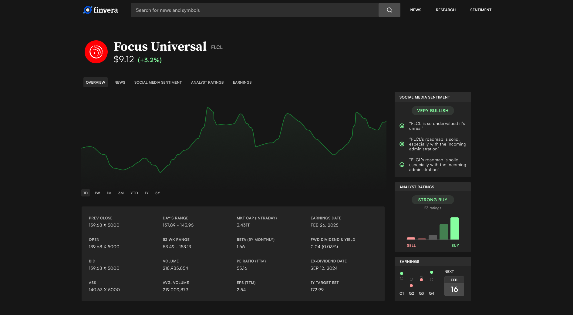
Quote page — real-time data, key metrics, and related news in one view
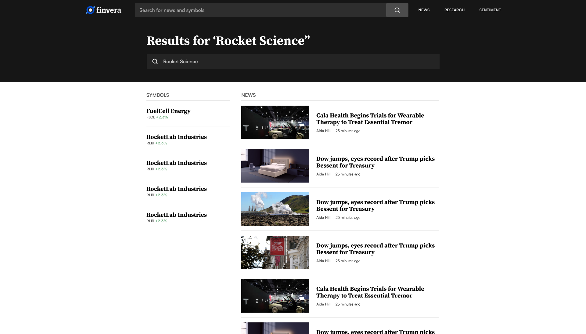
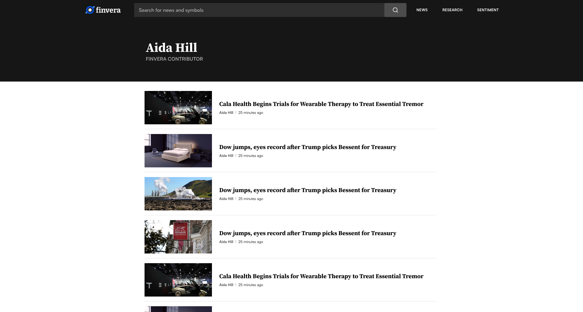
Search, Profiles & More
Search results, contributor profiles, and utility pages round out the platform. Every page maintains the same typographic scale and layout grid, so even rarely-visited pages feel like part of the product rather than an afterthought.